planet fitnessVisual Identity | Advertising | Branding
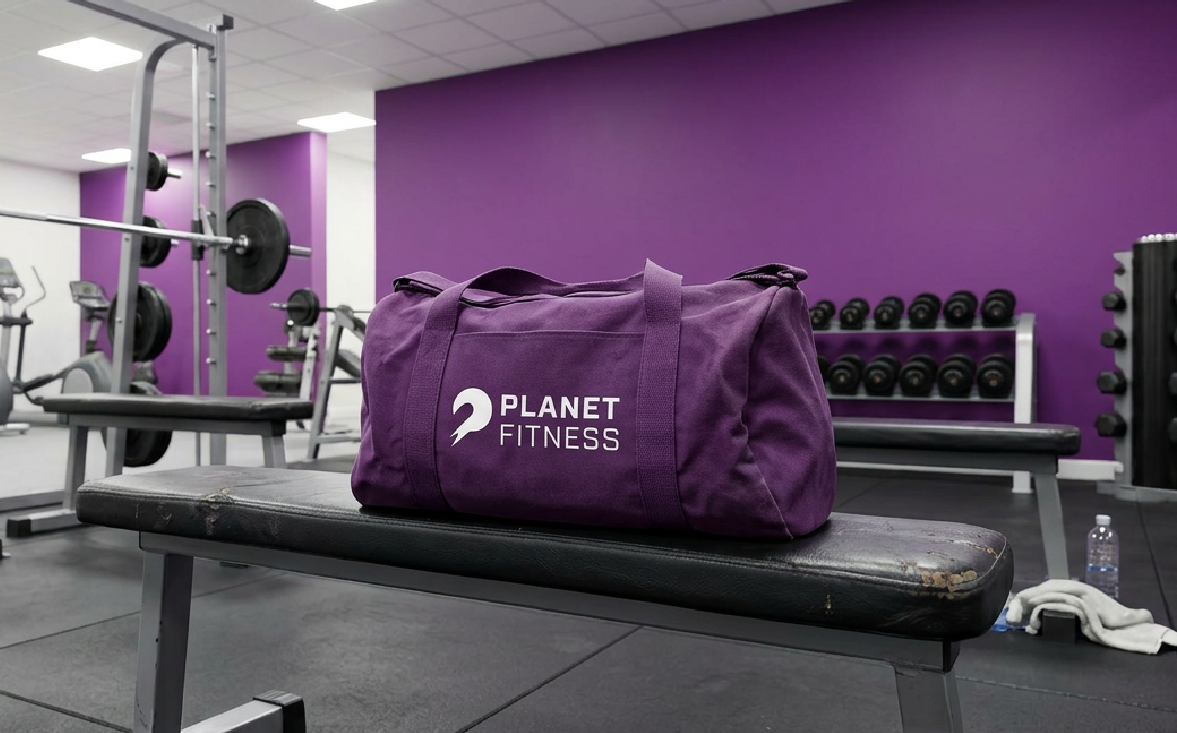
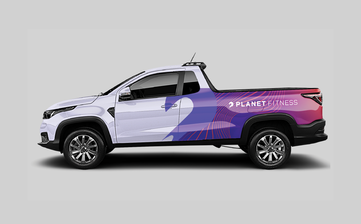
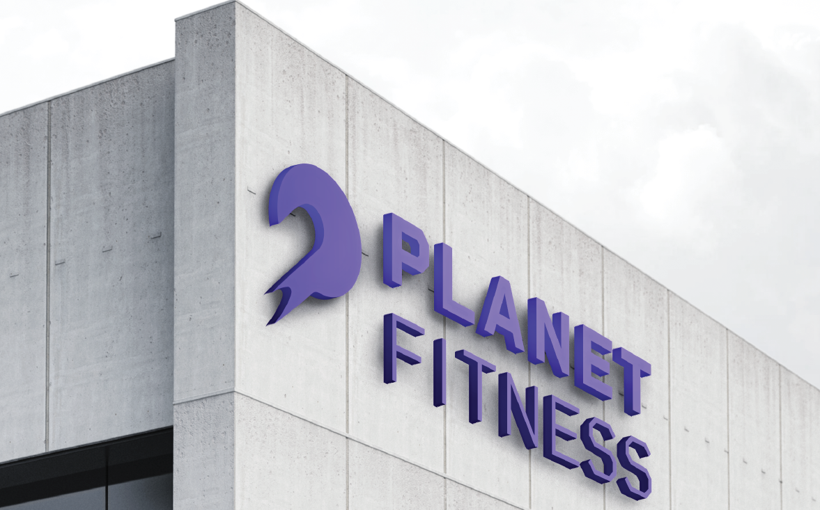
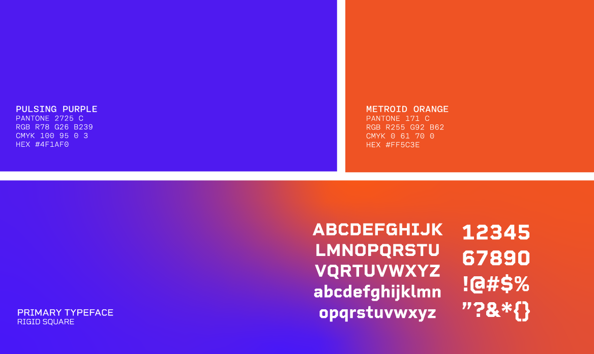
A proposed visual identity redesign for the gym franchise, aimed at improving brand clarity and modernizing its presence. The existing identity struggles with consistency, accessibility, and recognizability across platforms, limiting its effectiveness with a broader, more mature audience. The redesign introduces a refined colour palette and a more abstract, forward-moving logo mark. These updates enhance accessibility, improve digital adaptability, and reposition the brand as more contemporary and motivating.
2025
Sudbury, ON.
This a personal project.
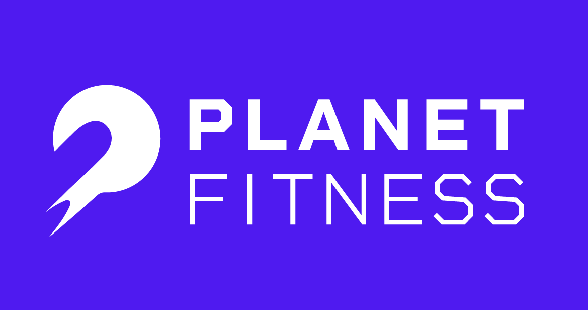
The original logo struggled with accessibility and recognition. For these reasons, the logo struggled in many applications including smaller applications, digital adaptability and a weaker sense of identity.


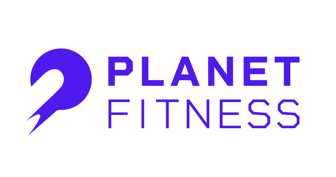
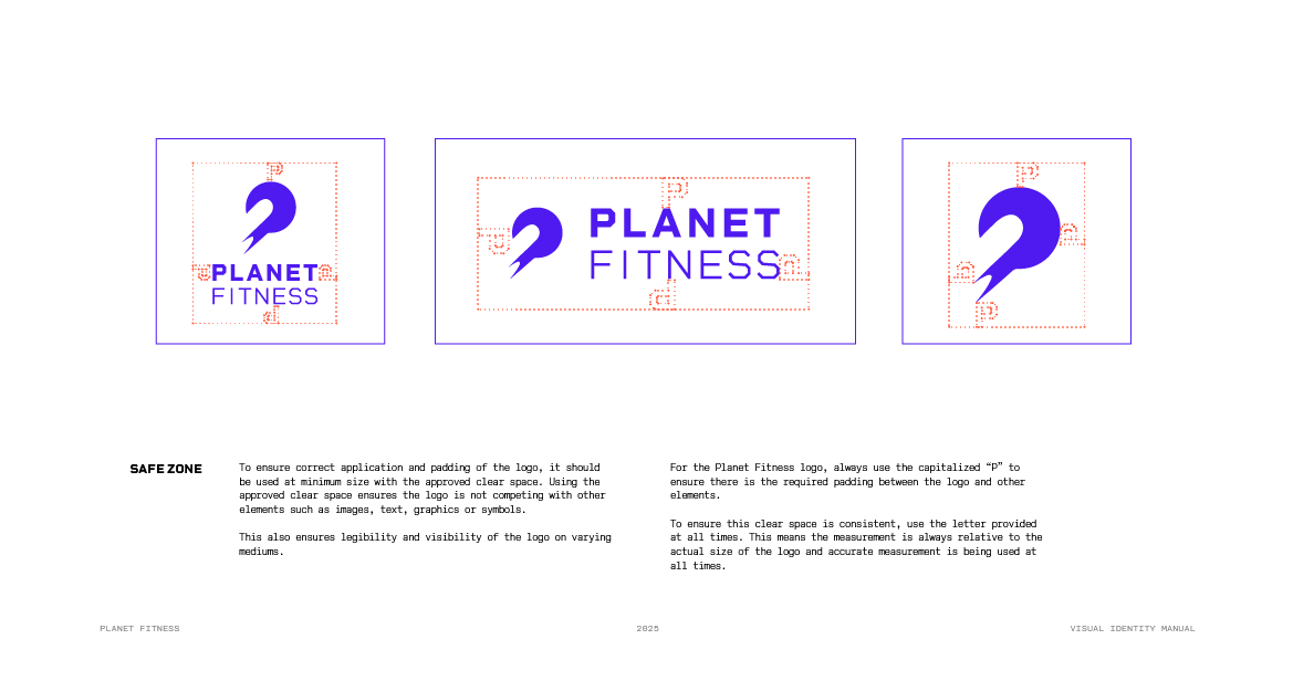
The proposed logo was designed with all logo orientations and formatting to suit digital and print applications as well as horizontal or vertical spaces. It’s simplicity lends itself to easy recognizability and can be adapted to a variety of interfaces.

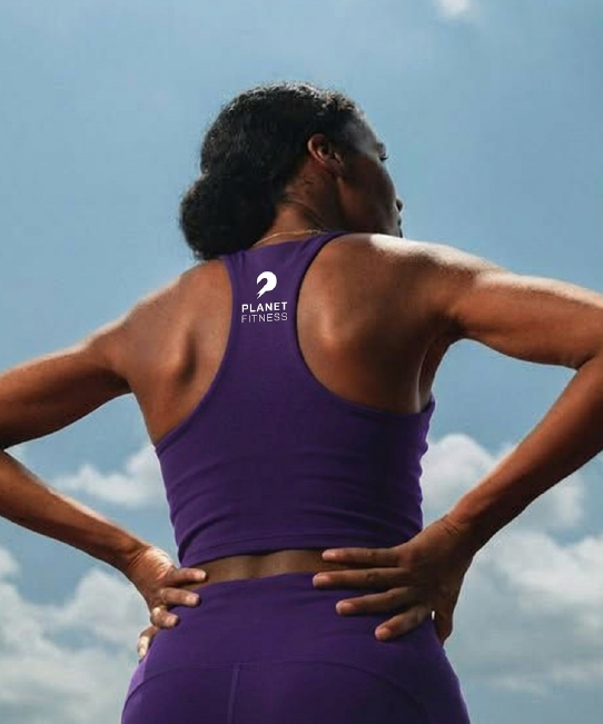
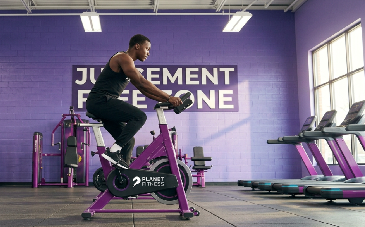
Considering their target clientele, Planet Fitness positions itself as a positive and welcoming environment for the regular, everyday person. Not the “Bodybuilder”, the “Instagram Baddie” or the “HYROX Hero”. Their gyms are for people to maintain their mobility, meet their fitness goals and stay active in between their busy schedules.